Retail Discovery: Design Sprint

Overview
For five days, the RP Consumer team ran a design sprint with as high fidelity to the book's prescription as possible. The focus of the sprint was retail email, as the vertical widely encompasses panel coming from a majority of end Return Path enterprise clients.
STACK
Sketch, Illustrator, Photoshop
Invision
Sprint Book by Jake Knapp
Zoom, Respondent.io,
Stickies, Sharpies, Whiteboard

Participants
Alex Boase - Product
Vincent Plummer - UX Designer
Ben Messner - Product Analyst / Support
Aaron Labrie - Sr. Engineer
Dane Carmichael - Engineer
Dan Corbin - Sr. Director of Product
Amanda Freeman - Jr. Engineer

Day 1: Synthesis of Pre-Work & Mapping
Activities:
Watched and took notes on the pre-sprint discovery interviews
Interviewed stakeholders about RP's need for panel in the retail and travel space
Invited a few people to the office for in person interviews
Wrote & Voted on "How Might We" Questions
Affinity mapping with sticky notes
Journey Mapping the retail experience
Conclusion:
Ultimately, we walked away from the day defining the problems around retail shopping and email. We also developed a flow diagram around the average persons experience with online and retail shopping.


Day 2: Sketching ideas
Each team member sketched ideas to try and solve for the following pain points:
Relevance
Wasted Time
Difficult to Locate
Difficult to Organize
Expiration of Deals
Differentiation (Online vs. Offline)
Most online coupons and offers don't work
Conclusion:
The popular solutions among our team involved:
a digest similar to Organizer
a folder structure that organized relevant offers and deleted expired offers
a photo option that allowed users to 'send to wallet' similar to Apple Wallet.
a website that organized by brand, and by expiring (similar to Shopami)
a chrome extension that organized screenshots of deals.
"hot or not" style of browsing of deals.
Day 3: Decide on a plan
We determined we were going to try and solve for the organization problem with a site that allowed users to organize alphabetically, by expiration, and encouraged them to save the offers they want.
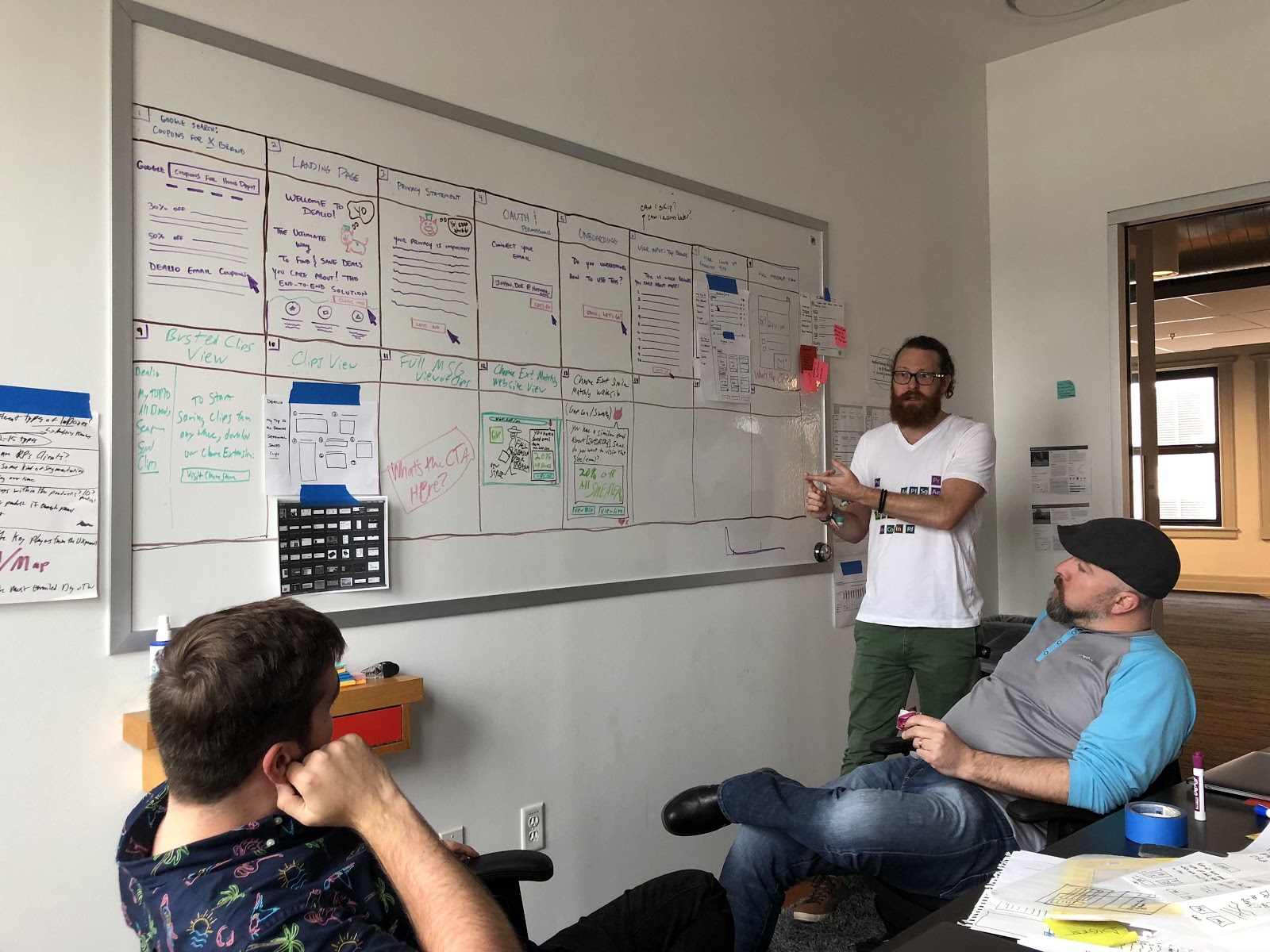
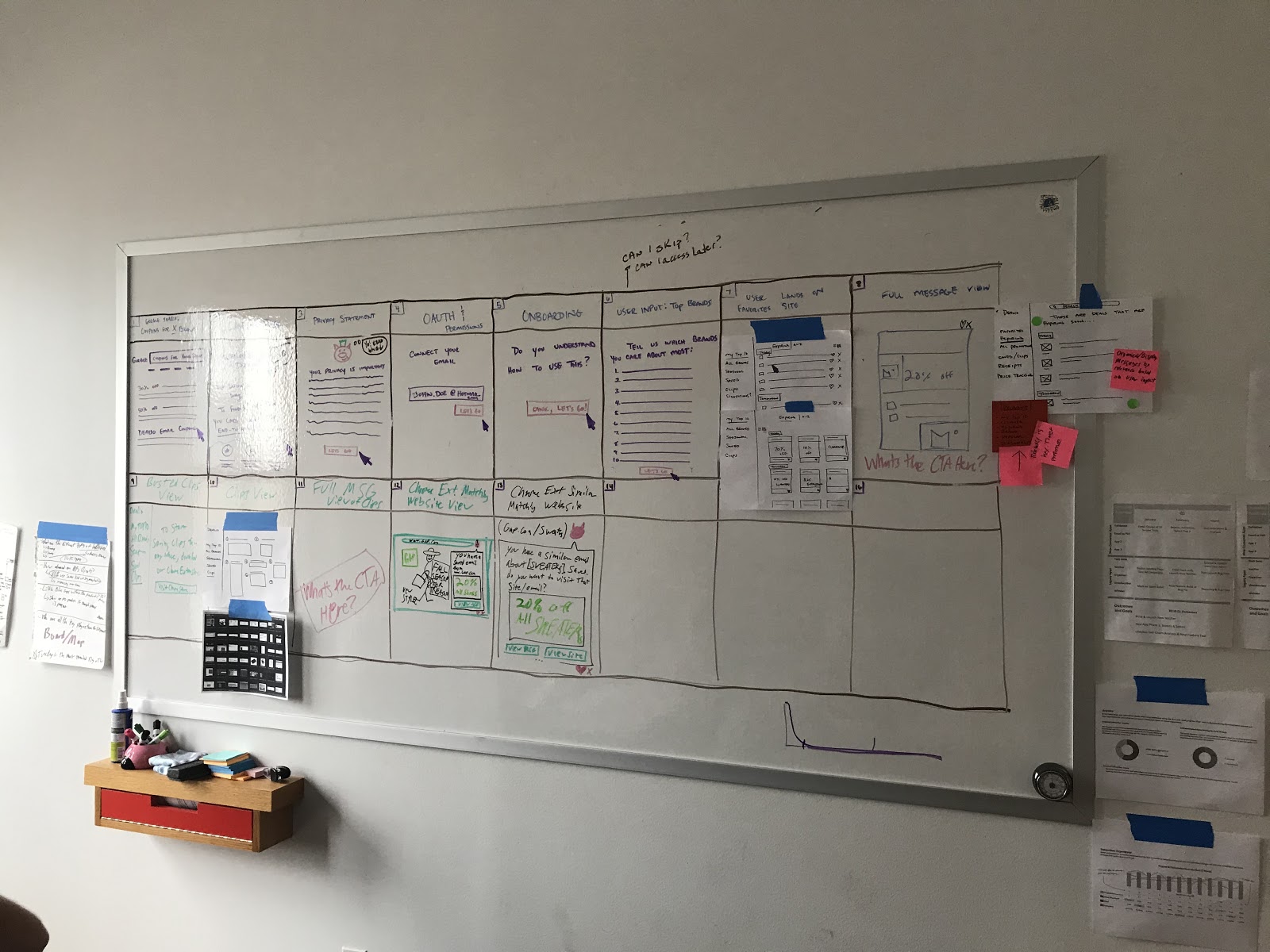
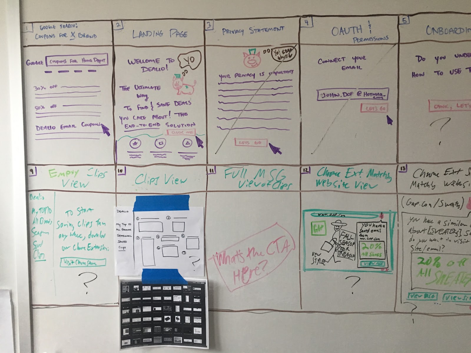
Day 4: Prototype
Twas' a long day (night) of mocking up all the things!!


Day 5: Test

Today we tested the prototype by inviting users through respondent to come in person to the office. Ben ran user interviews while the rest of us sat in the other room and took notes. It was helpful to organize the tested concepts in columns so that we could easily hop up and add sticky notes when we noticed something of interest in each user interview.

Discussing the interviews...
ACTION ITEMS
Add “How do you search the internet for deals or coupons to interview questions”
Google Results
Dealio is not in the copy of the our ad
What is the focus of the headline? Some resonated with “organization” and some resonated with “never miss a deal” so we need to pay attention to this.
“I Always skip over adds and start at number 4”
Landing Page
Retail Me Not doesn’t work x 14
People didn’t understand what our “platform page” was...were we in their email? Was it an app? “WHAT IS IT?” Not obvious that it was pulling email from inbox.
Vince has a solution for this about showing a tablet, phone, computer all side by side
“Sign up with your email” is the wrong CTA? +1
Is this a symptom of platform uncertainty?
“I don’t want to have to keep emails in my inbox so they show up elsewhere?” I like to delete +1
Consider the location of CTA buttons. Top Right one was most popular but maybe biased.
Notifications gives people pause until they realize they can CONTROL it. Notifications were popular though
Tell or show what type of notifications are possible
“Work” on landing page meant something different to Jane. Consider a better word.
“Company” instead of Brands...make a switch ??? Top 10 view
Images did not convey what our CTA or feature was...Vince has a way to fix this.
Improve copy around “how it actually organizes” and that we take action on their Inbox.
People wanted this to be a “coupon locator” and not just the deals in their Inbox. +1
Dealio will help you “find the best deal” is very misleading text because the action is much different
Sign Up
Reorganize the Oauth
Tell them why we need their email
Brand Input
People felt 10 brands was too much
People wanted the app “do the work for you” +1
Add: these are you most frequent senders...want to add more?
This section was unclear
Organizing your Deal Magic Screen
Improve the copy. Make it more explanatory
Do some animation. No more dead pig eyes
How to deal with initial snapshot delay
Top 10 View
Add the Grid view screen option
People looked at left nav first +1
Everyone missed that it was organized by Expiration +1
Need CTA around “view message”
Highlight column header for organization type
THe link between filling out the top 10 and it landing on the top 10 view was not obvious to people. (My Hot Brands)
Nobody understood that you could save emails
“Where am I?” confused to what page or platform they were non?
Confirmed expiring deals was important to users
Saved Deals
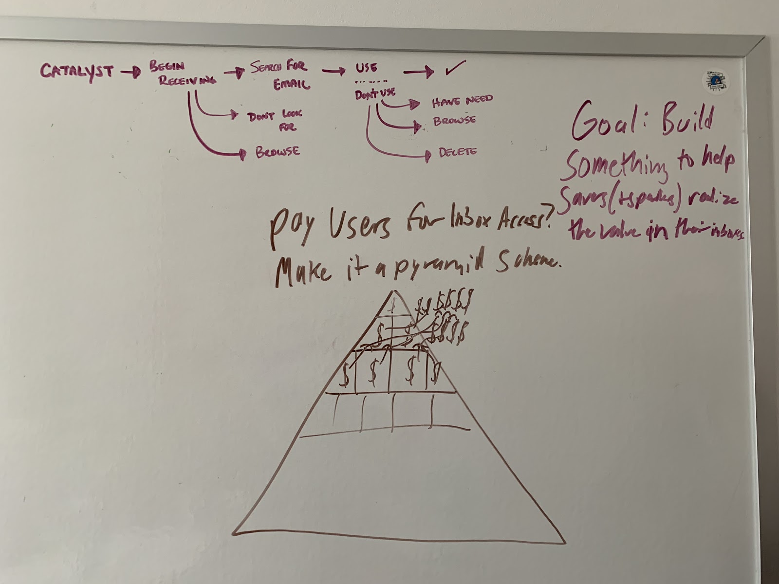
Need to have lots of conversation around “Saved Email” (call it “Save for Later?”) +1
Saving is a 2 part action. We ask them to save so they can use it in the extension
Difference between save and clip (copy work needed)
Pinterest is a great use case for clips
“I am surprised that these deals are only from my email. “
Should “saved deals” be in top right corner
I want to use a coupon immediately rather than save for later (heard this a lot)
Clips
What does this view look like on my phone
Need a MOBILE PROTOTYPE
Clips should have a saved version of what a clip would look
Filter by store & by expiration date
Chrome Ext
Needs to say “you have a saved email from target” at the top by the Extension
Cross site relevance (is it possible) on the first time visit the page.
Full Message
Needs to be more obvious that it is the email…
Maybe just needs to be the necessary content for them to take action
Major displeasure that it takes them to their email and not just inputs the code
They want the message to take them to the deal
Need a more clear CTA on this part
Looks like I left the app now
I want to go straight to deal
I want to see the deal for TV when I am looking for TV
“I now want to search to see if there is a better deal than the one I saved” Carrie
Halloween Seasonal
Work on the copy of “Seasonal v Dropping them into the current season”
Competition “POCKET”
CVS forces email to be uploaded into the app. It sucks
Dress Up Ghost Pig +1
Notable Phrases
I thought you were going to organize my email in my inbox.
I thought this was going to be in my inbox.
I want you to take action in my inbox.
I may use Dealio more if it was in my email
Wallet feature
Think about Suggestions and if we should keep it.
Maybe add Trending instead of suggestions.
“It is an extra step. Usually searching for deals in my inbox is mindless” +1
Sprint Retro
What went well.
Overall team collaboration +2
Team Design
Designing as a team, next to each other +2
Engineers dialed in to the process from the beginning +1
Not letting design get to far down the road on their own +1
Team sketching
For Ideation +3
Pre-work done by Alex and Vince really set us up for “success”
Attitude:
Aaron and Dane stayed up open and flexible despite not having been exposed to a Sprint before and some of the Activities we use!
People stayed open to “pushback” on their ideas
Remarkably impressed by how well the interviews went +1
The Front interviews and the Back interviews
Had a ton of input before and and at the end
Having two different rooms was extremely valuable
Note taking grid was a great way to do it +1
Respondant.io is an amazing tool
Going by the Book
Team dedication
Fixing things on the fly during interviews +1 +1
Green multi-sticky dot voting to zoom in on what’s most important +1
Art Museum worked well +1
Straw Poll worked well
Exposure to validation process
Monday
Determining Pain Points
Thursday
Alex & Vince designing side by side
What Should We Do Differently Next Time?
Everybody has to be 100% on board +1 +1
Can’t allow for floating in and out (which is what our company does often)
Need more consistent facilitation
Phones
Prework to determine goal/main question of sprint should be done well ahead of time
Go even MORE by the book
Facilitator there the whole time is v important +3
Monday
Determining the big question we wanted to answer
Determining the questions that must be true in order to proceed
Definition of problem to solve for
Need a Scribe
Where did we land yesterday
What did we learn
Thursday +1
Alex & Vince took over most of To-Dos and had a 12 hour day
Add spikes?
Add small engineering functionality to prototype?
Consistently ask the same quantified questions to be able to compare them
Not sure of my role
Schedule fun +1
More snack and lighter snacks
DO THE MAP
We should not have separated on Day 4 +1
Ben’s copywriting direction +1
Move out to a bigger/open space +3
What Did We Learn About The Process?
Role definition
Start prework sooner
It’s haarrrrrddd
on the body and the mind
Make it longer/make it shorter - so it’s not so taxing
Leaves not a lot of time for team building
There’s a loooooot of whiteboarding
Impossible remote - realtimeboard is not a great solution to this +1
What Still Puzzles us About the Process?
How the hell do you stay ‘on’ for 8 hours a day?? +1
I drank more coffee in that Beweek than I have in 6 months
Monday is still confusing
Prework needs to really be buckled down
But how?
What can we take from Sprint into every day work?
What can we take from Sprint into every day work?
Dot Voting to shorten conversations and debates
Alex needs a Sketch license
Ben should get facilitator training
Snack table was a great idea