Email to PDF
Overview
Email to PDF is a chrome extension for Gmail that allows a user to select messages (single or in bulk), extract attachments, and download them as PDFs.
The Challenge
As a user, there is difficulty downloading and extracting important files and emails. This is especially the case when
Fix account creation and grow existing user base.
Reduce churn
Solve any usability problems.
My Role
As the sole UX / UI Designer on the project, my responsibilities included:
Discovery: Smoke tests, Stakeholder & User Interviews, Video Editing, Affinity Mapping
Definition: Identifying KPI's, Persona, Product Flows, Value Proposition, Information Architecture & Product Flows
Design: Style Guide, Visual Design, Prototyping, Branding, Marketing Assets
Contributors
Alex Boase, Aaron Labrie, Dane Carmichael, Cecy Correa, and Ben Messner
Stack
Discovery: Instapage, FB Ads, Google Adwords / Analytics, Realtime Board
Definition & Design: Sketch, Invision, Respondent.IO, Adobe Premiere CC
Handoff: Zeplin, Jira
Communication: Google Sites & Realtime Board
Discovery
After performing a deep dive analysis on the quantitative data (using Instapage smoke tests, FB Ads & Google Adwords) and qualitative data (from user interviews - I used Respondent.IO to recruit participants) we were confident in our decision to build Email to PDF. We used Realtime Board for affinity mapping and general team synthesis.
Logos & Branding
One of our users from an early round of smoke test validation (Brooke)mentioned that she liked the coral color and it inspired a theme of an sea theme. An octopus, busily converting emails to PDFs, seemed like a fun consumer mascot for this product. After riffing with the design team, a pretty thorough round of internal testing was done on a handful of logos and a winner emerged.
A designer named Pablo Stanley created a plugin "avataaars" that I used to create the 'What people are saying" avatars. The submarine, of course, is searching for panel at the bottom of the ocean. ;)
Landing Page
Design for the landing page was done responsively and we experimented with SVG backgrounds. Design was built around the material design system and a sketch plugin was used to help build the library. The engineers adapted a version of this with a library from Materialize.css
It was a good opportunity to better understand grid systems and responsive layout with a more formulaic approach. This enabled our team to move faster instead of having to build each asset from scratch.
personas
Based on the research, we discovered two pain points that will help inform our positioning and marketing of the product. Offline access vs. Migration / Downloading in large chunks. I created two primary personas to design for. Brooke the business woman, and Daron the downloader.
Brooke's primary issue is offline access when she travels for work. Daron's primary issue is his desire to download and backup large amounts of emails, documents, and attachments for both business and personal reasons.
There is an overlap in the two personas that we believe we can address for Gmail users, but there is an opportunity to address more people like Daron with an app that has access to older email service providers like Aol, Hotmail, Microsoft, etc. That is the primary location that Daron is trying to migrate and download from.
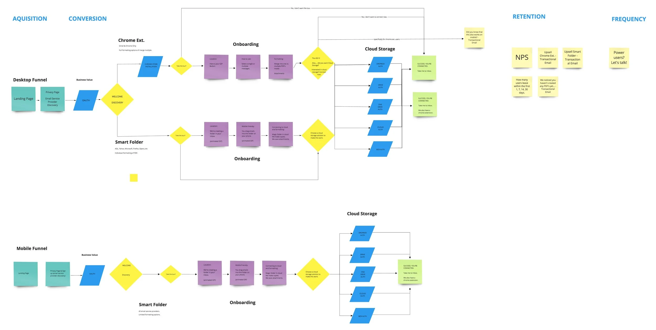
Product flow
We used real time board to collaborate and agree on a flow.
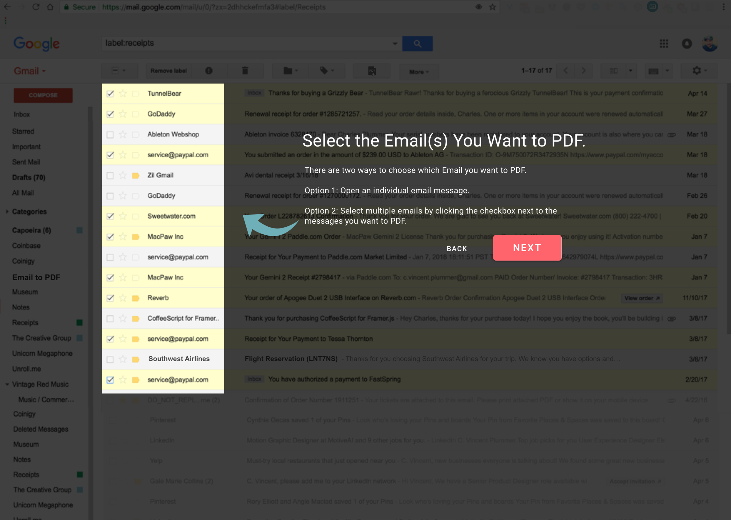
Onboarding & Experience
what’s next?
The intention was to test a chrome extension in the market prior to launching with other email service providers. However, Google made a decision in mid November 18’ to limit access to inboxes with their new API policy framework. Regardless of our teams commitment to being incredibly transparent at safeguarding anonymized and redacted user data, this was a pretty disruptive force and caused us to pivot in a different direction.


